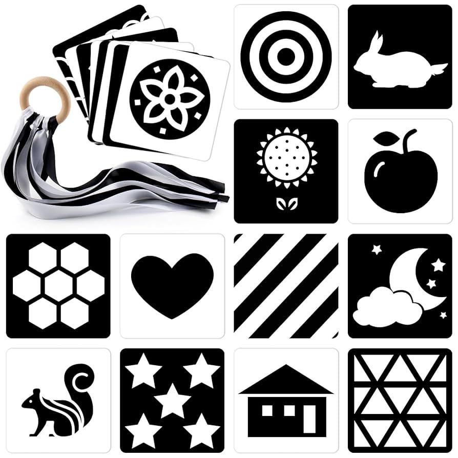
In a world saturated with screens and vibrant visuals, protecting our eyes has become more important than ever-especially for the youngest among us. Enter high-contrast flash cards, a simple yet powerful tool designed to engage early learners without straining their delicate eyesight. These cards use bold, striking patterns and colors to capture attention and stimulate cognitive development, all while prioritizing visual safety. This article explores how high-contrast flash cards offer a thoughtful balance between educational effectiveness and eye-friendly design, making them an essential addition to every child’s learning journey.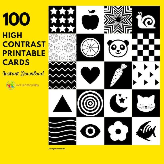
High-Contrast Design Principles That Enhance Visual Clarity
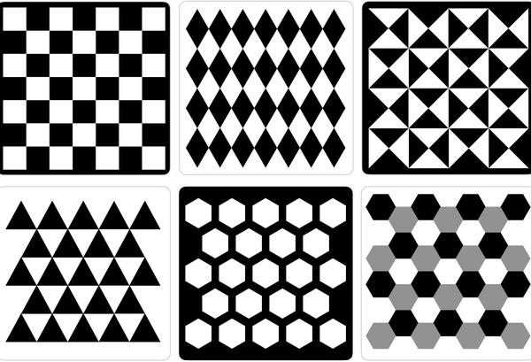
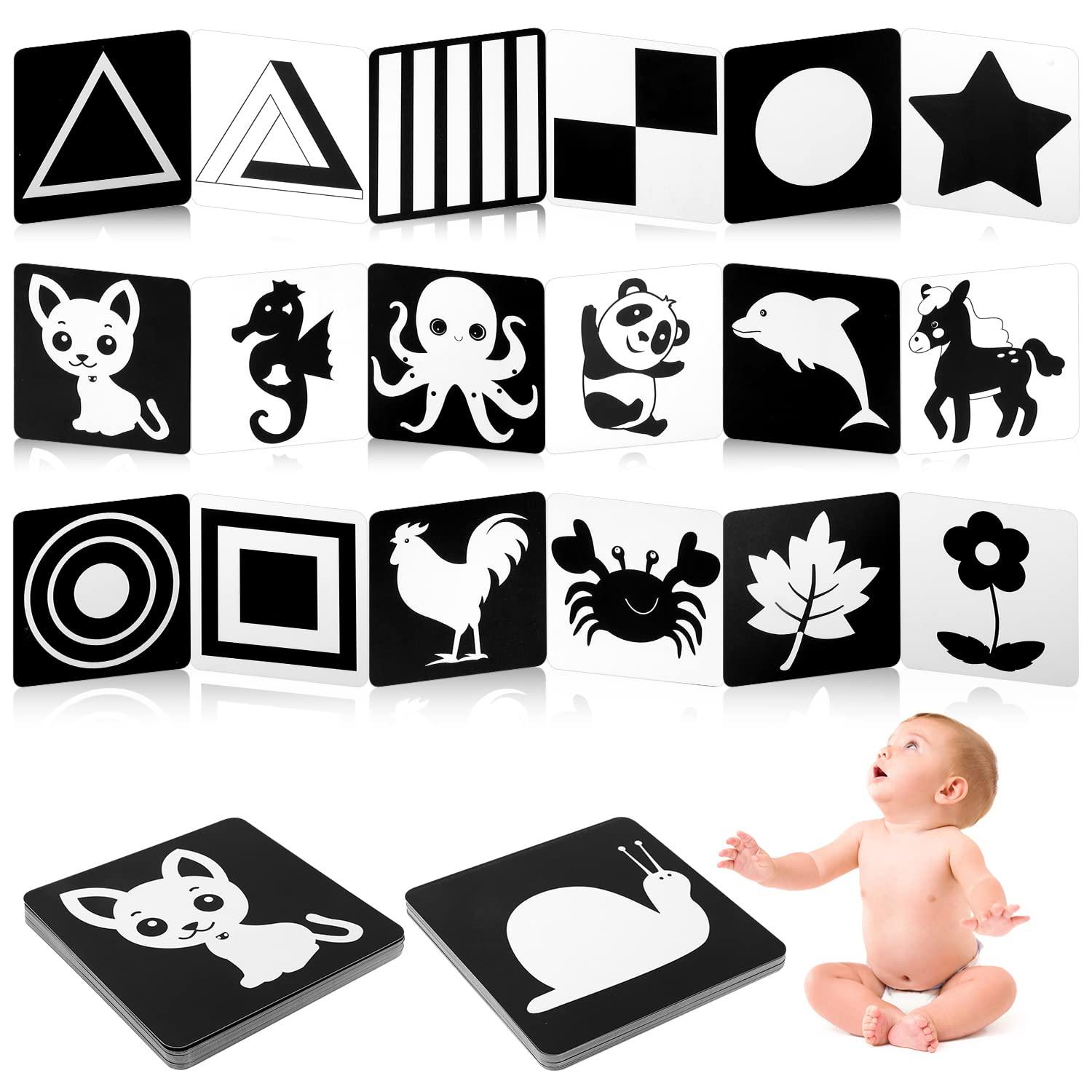
Achieving optimal visual clarity starts with maximizing contrast between foreground and background elements. This can be done by pairing dark text against light backgrounds or vice versa, ensuring every letter stands out crisply without strain. High contrast minimizes visual noise, allowing the eyes to effortlessly distinguish shapes and letters. Designers often leverage this by using bold fonts in stark color contrasts, such as black on white or bright yellow on deep navy, to create flash cards that are both attention-grabbing and comfortable for extended viewing.
Incorporating these principles can be broken down into practical guidelines:
- Consistent use of contrasting colors to emphasize key content without overwhelming the senses.
- Appropriate font weight – opting for medium to bold to enhance legibility on small flash cards.
- Clear spacing between lines and elements to prevent clutter.
- Minimalistic design that avoids excessive patterns or gradients, keeping the focus on the information.
Below is a simple comparison of contrast ratios and their corresponding readability impact:
| Contrast Ratio | Visibility Level | Recommended Use |
|---|---|---|
| 21:1 | Outstanding | Primary headings, flash card titles |
| 7:1 | Excellent | Body text, secondary details |
| 4.5:1 | Acceptable | Less critical info, footnotes |
Materials and Manufacturing Choices for Eye-Friendly Flash Cards
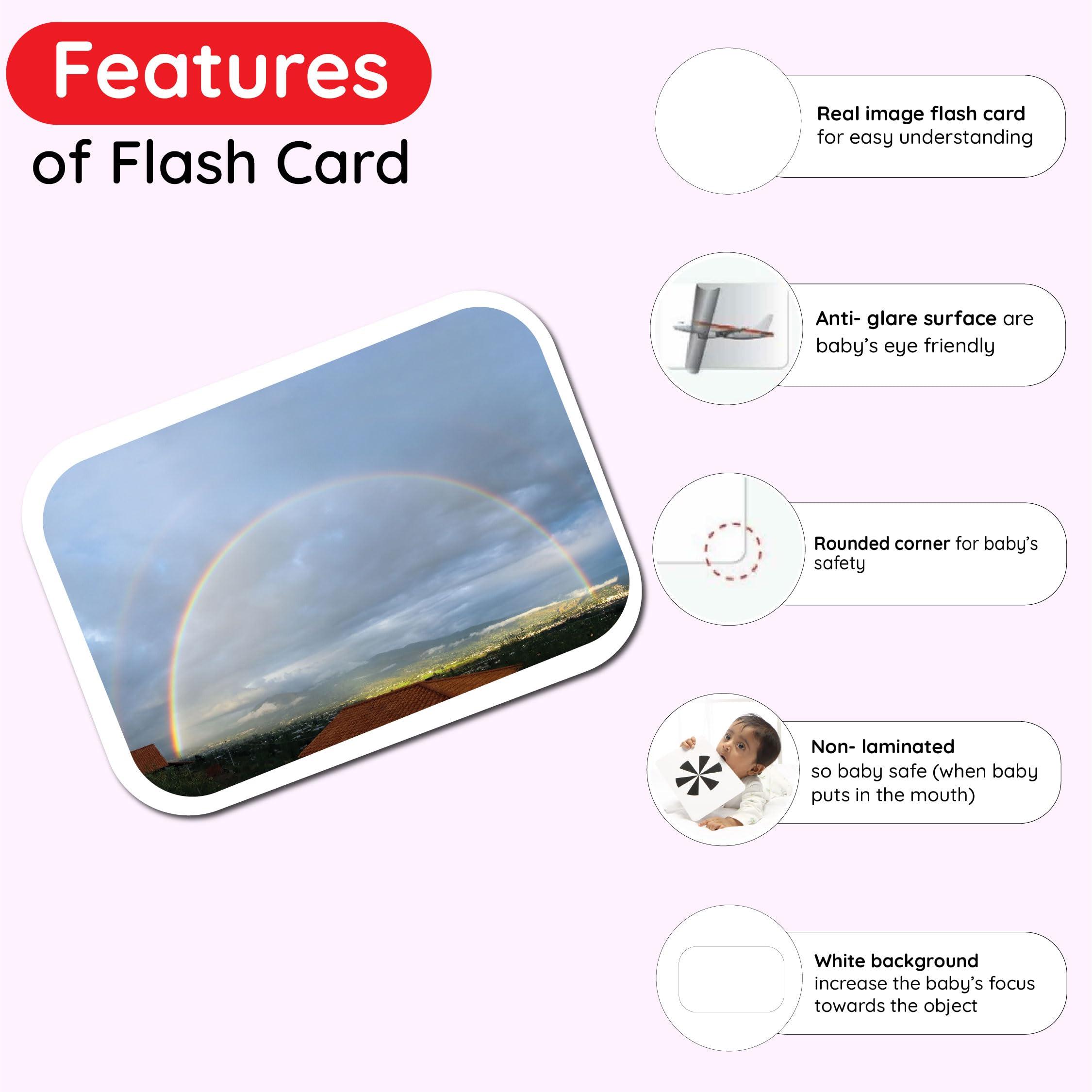
Choosing the right materials for flash cards significantly impacts both their durability and eye-friendliness. Opt for non-glossy, matte finishes that reduce glare, ensuring that light reflection does not strain the eyes during extended use. Using thick, high-quality cardstock with a smooth texture offers a comfortable tactile sensation, making the cards easier to handle and preventing visual distractions caused by warped or flimsy papers. Additionally, employing environmentally friendly inks with consistent pigmentation helps maintain clear, sharp contrasts without harsh brightness.
Manufacturing processes also play a crucial role in optimizing eye comfort. Incorporating rounded corners and smooth edges not only enhances safety but also reduces visual clutter. To make the flash cards truly comfortable for viewers, utilize color schemes that provide high contrast without excessive brightness, such as deep blacks paired with soft whites or gentle pastel backgrounds. Below is a quick comparison table highlighting some key material properties ideal for eye-friendly flash cards:
| Feature | Recommended Material | Benefit |
|---|---|---|
| Finish | Matte Lamination | Glare Reduction |
| Paper Thickness | 300-350 gsm Cardstock | Durability & Easy Handling |
| Ink | Eco-friendly Pigmented Ink | Consistent Contrast |
| Edges | Rounded Corners | Enhanced Safety & Reduced Visual Clutter |
Best Practices for Using High-Contrast Flash Cards to Reduce Eye Strain
To maximize the benefits of high-contrast flash cards without compromising your eye health, it’s essential to maintain a balanced approach. Start by keeping your viewing distance comfortable-ideally between 12 to 18 inches from your eyes. This spacing reduces strain while allowing the vibrant contrast to work effectively. Avoid excessive brightness by adjusting ambient lighting to softly illuminate the area without creating glare or reflections on the card surface. Integrate regular breaks following the 20-20-20 rule: every 20 minutes, look at something 20 feet away for 20 seconds. This simple practice helps reset your focus and prevent fatigue when using high-contrast visuals.
- Choose cards with clear, bold fonts on backgrounds like black and white or yellow and navy, which offer sharp visual clarity.
- Alternate reading sessions with other low-contrast materials to allow your eyes to adapt naturally.
- Use cards under natural light or quality LED lighting with adjustable warmth to reduce harshness.
| Practice | Benefit |
|---|---|
| Adequate viewing distance | Reduces eye fatigue |
| Balanced lighting | Minimizes glare |
| Regular breaks (20-20-20 rule) | Improves focus and comfort |
| Alternating reading materials | Prevents overexposure to high contrast |
Recommendations for Selecting Safe and Effective Flash Cards for All Ages
When choosing flash cards, prioritize those that combine high contrast visuals with soft, non-glossy finishes to reduce eye strain during learning. Colors like black and white or deep blue and bright yellow enhance readability for learners at any age, especially young children developing visual acuity or seniors with sensitive vision. Avoid overly bright neons or highly reflective surfaces as they can cause glare and discomfort. Additionally, selecting cards printed with non-toxic, fade-resistant ink ensures safety and longevity, making them a reliable resource for repeated use over time.
Consider these key features to select flash cards that support both comfort and effective learning:
- Clear Fonts and Bold Images: Simplify recognition and memory retention with easily distinguishable text and symbols.
- Durable Materials: Opt for heavy cardstock or laminated finishes to withstand frequent handling without wear.
- Size and Weight: Smaller cards are handy for quick practice, while larger cards suit group activities and easier handling.
| Feature | Benefit |
|---|---|
| High-Contrast Colors | Enhance visibility and reduce eye fatigue |
| Matte Surface | Eliminate glare for clear viewing from any angle |
| Non-Toxic Ink | Ensure safety for all age groups |
| Card Thickness | Promote durability and easy handling |
In Conclusion
In a world where screens dominate our daily lives, finding eye-friendly learning tools becomes more important than ever. High-contrast flash cards offer a simple yet effective solution, blending clarity with comfort to engage young minds without straining their eyes. By choosing materials designed with visual health in mind, educators and parents can create a nurturing environment where curiosity flourishes safely. As we continue to explore innovative ways to support learning, these bold, vivid cards remind us that sometimes, the clearest path to knowledge is also the gentlest on our vision.